

Widgets
The palette ships with 29 widgets, grouped by category. Widgets belonging to a disabled module never appear in the palette and render as nothing on the public site — so switching the shop off does not leave broken product grids behind.
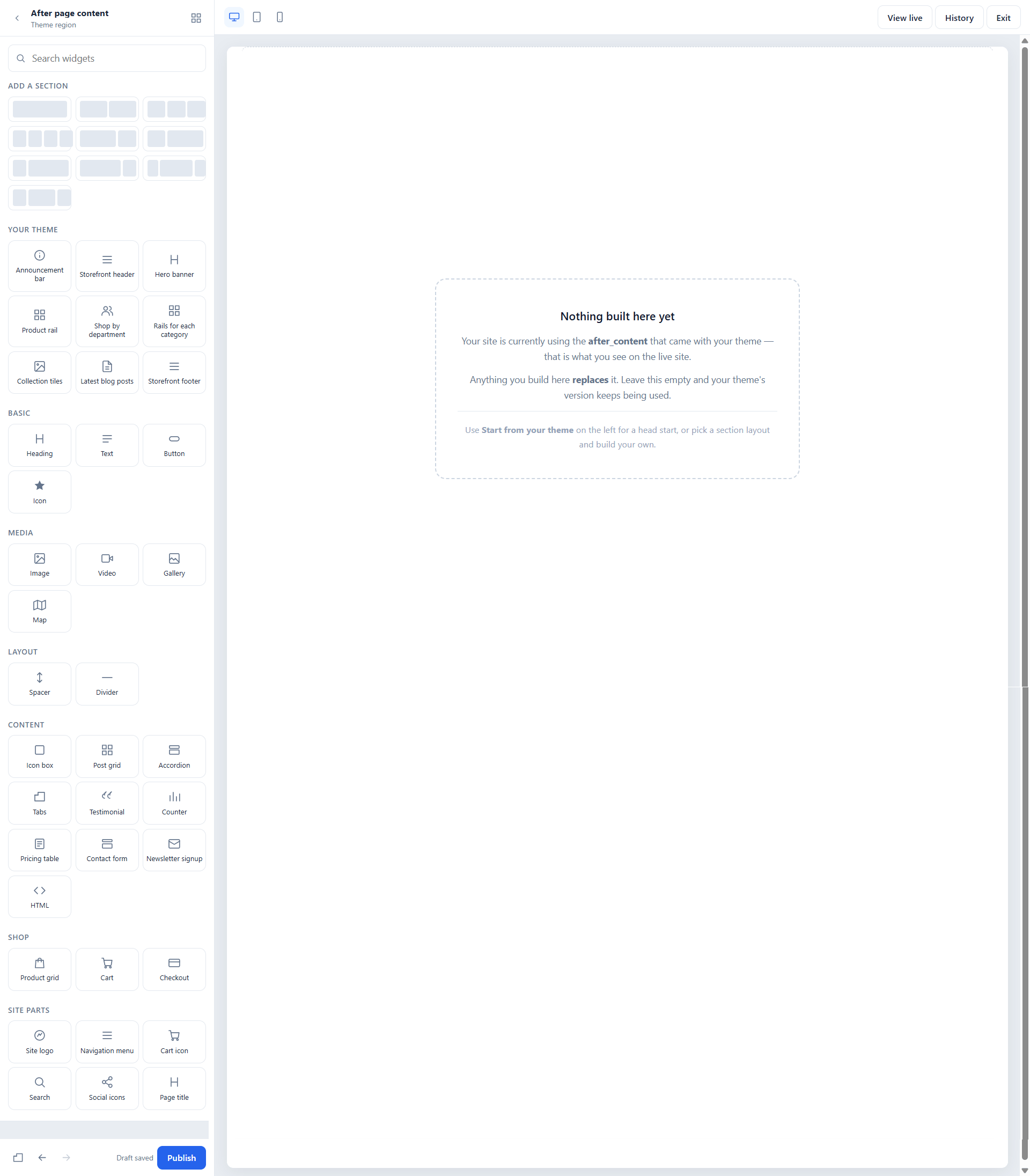
Basic
| Widget | What it does |
|---|---|
| Heading | An h1–h6 with its own type controls |
| Text | A rich text block |
| Button | A link styled as a button, with size and variant |
| Icon | A single icon at a chosen size and colour |
Media
| Widget | What it does |
|---|---|
| Image | One image from the media library, with caption and link options |
| Video | An embed from YouTube or Vimeo, or a self-hosted mp4/webm |
| Gallery | A grid or carousel of images |
| Map | An embedded map at a given address or coordinate |
Layout
| Widget | What it does |
|---|---|
| Spacer | Vertical space, per breakpoint |
| Divider | A horizontal rule with style controls |
Reach for section and column padding before a spacer. A spacer is a real element in the page; padding is not.
Content
| Widget | What it does |
|---|---|
| Icon box | Icon, heading and text — the standard feature block |
| Post grid | Recent or filtered posts, in a grid or list |
| Accordion | Collapsible rows, good for FAQs |
| Tabs | Tabbed panels |
| Testimonial | A quote with an attribution and optional photo |
| Counter | A number that counts up when scrolled into view |
| Pricing table | A plan with a price, a feature list and a call to action |
| Contact form | The contact form, anywhere — needs the contact module |
| Newsletter | A subscribe field — needs the newsletter module |
| HTML | Raw markup |
The Post grid
Filter by category, tag or author, choose how many, and pick a layout. This is what you build a blog landing page out of without touching a template.
The HTML widget
The one place raw markup is accepted as-is. Everything you put here reaches the page unfiltered, so:
Anything you paste here runs
An HTML widget will happily run a <script> tag. Only paste markup you understand — a tracking snippet from your own analytics account is fine, a "free widget" from a forum is how sites get compromised. For analytics, prefer Settings → Appearance → Header scripts, which keeps it in one place.
Shop
| Widget | What it does |
|---|---|
| Product grid | Products by category, tag, or hand-picked |
Needs the shop module. Disabled, the widget disappears from the palette and renders as nothing.
Product page
These widgets build the product page template. Open it from Builder → Site pages → Product page, or with Open the builder on any product, which previews the template with that product. The widgets hold no product of their own: each one shows whichever product the visitor is viewing, so one design serves the whole shop. They only appear in the palette while you edit that template.
The first time you open it, the template starts as a copy of your theme's product page, built from these widgets. It stays a draft, and shoppers keep seeing the theme's page until you press Publish. To design one product's description instead, use the description builder link on the product's edit screen.
| Widget | What it shows |
|---|---|
| Breadcrumbs | Home / Shop / category / product |
| Product images | The featured image and gallery, with thumbnails on the left, below, or hidden |
| Product title | The product name, with an optional category link |
| Star rating | Average rating and review count, hidden until the first review if you prefer |
| Price | Price, crossed-out price and saving badge on sale items, and the tax note |
| Short description | The product's short description |
| Add to cart | Option picker, quantity, Add to cart and Buy now, all with editable labels |
| Stock status | In stock, low stock (Only :count left), out of stock and digital wording |
| Trust badges | A row of icons with labels, such as Secure payments or Tracked delivery |
| Description | The full description, collapsible or always shown |
| Product details | SKU, categories, weight, dimensions and delivery, each row switchable |
| Reviews | Approved reviews, plus the form for writing one |
| Related products | Other products from the same categories |
Keep the Add to cart widget
Without it nobody can buy. The editor shows a warning while the template is missing it.
Buy now adds the product to the cart and goes straight to checkout. It works without JavaScript.
While you design, the preview uses the product you opened the builder from. Opened from Site pages, it uses your newest published product.
Site parts
These read from the site rather than holding their own content, which is what makes them the building blocks of a header or footer designed in the builder:
| Widget | Renders |
|---|---|
| Site logo | Your logo from Settings → General, light or dark variant |
| Navigation menu | Any menu, by location — see Menus |
| Cart icon | Cart link with a live item count — shop module |
| Search | A search box for the whole site, posts or products, with live results. See Site search |
| Social icons | Links from Settings → Social |
| Page title | The current page's title — for use in theme regions |
Page title only makes sense inside a theme region, where one layout renders across many pages.
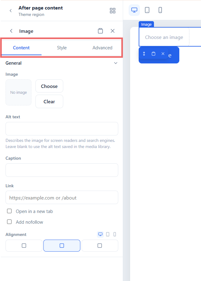
Every widget has three tabs
| Tab | Holds |
|---|---|
| Content | What the widget shows |
| Style | Colour, spacing, typography, borders — applied as CSS, instantly |
| Advanced | Margin, custom CSS class and id, visibility per breakpoint |
Hiding a widget on one breakpoint
Advanced → Visibility. Useful for a desktop-only decorative image, or a simplified mobile call to action. The element is not rendered at all at that breakpoint rather than hidden with CSS.
Adding your own
One PHP class and one Blade view. See Building a widget.